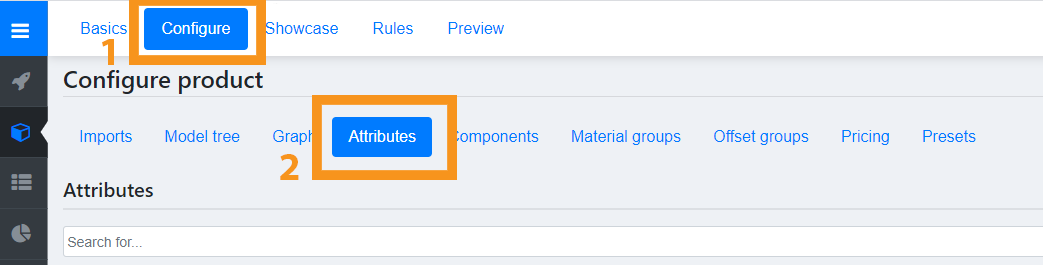
Let’s dive into the Attributes tab within Expivi. You can find this tab inside your product and by navigating to Configure → Attributes.
In this tab, you can find the attributes, the qualities of a product. The ‘questions’ and ‘answers’ that you want to ask your customers. Some of them are automatically configured from the hierarchy as explained in the hierarchy page. Attributes can be organized by drag and dropping them into the desires order.
First, a few things to keep in mind while working with attributes:
- Every option can be deleted by clicking the red ‘delete’ button (on the bottom of the node that you want to delete). If you’re sure you want to delete this, click ‘confirm’, if not, click ‘cancel’. Warning: By deleting the node, all configurations that are linked to this option will be deleted as well.
- After you changed anything, press the blue “save changes” button on the top right before you continue to another tab. All progress will otherwise be lost.
Table of Contents
Add a new attribute
To add a new attribute click the green +Add attribute button on the top right.
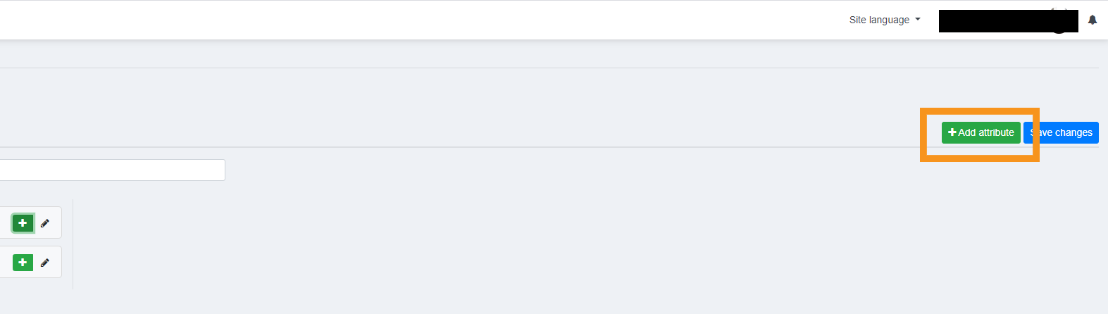
When pressing the green button, a list of attributes to choose from will appear. Choose one and give your new attribute a name. The list will display all attribute options available. We will go through them one by one below.
Step
A step is much like a folder. It can contain other attributes to organize your configuration flow.
Creating a Step Attribute:
- Select step
- Name the step. This can be anything you want.
- Click on ‘add node’
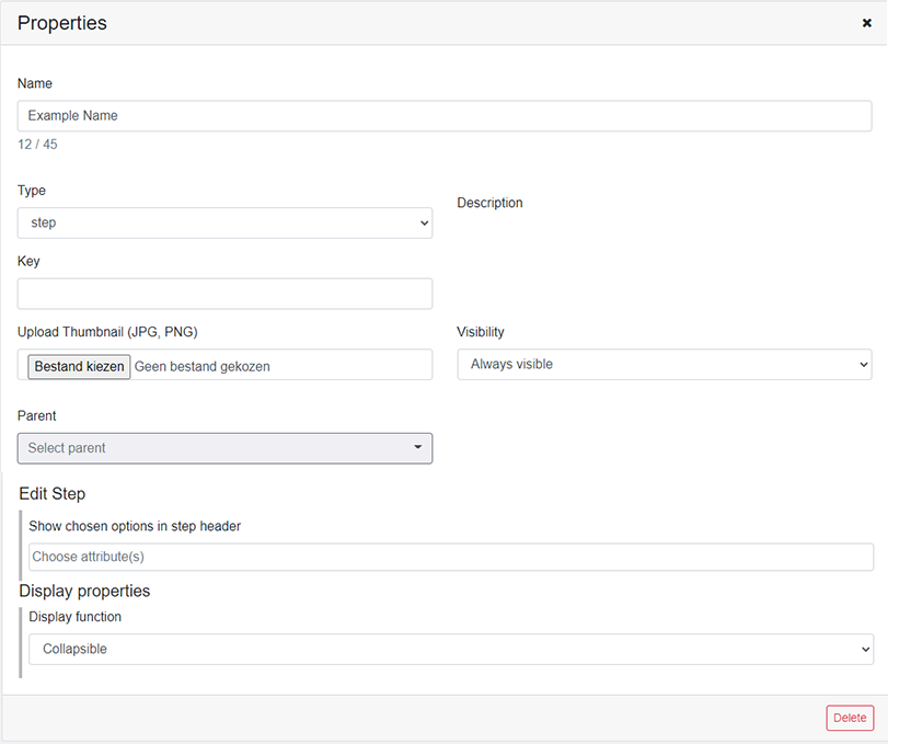
To edit the step attribute, click on the pencil icon next to the Steps name. It will show you a new window where you can change several attributes.
- Name: You can fill in or change the name of the step
- Description: Add a description (optional)
- Visibility: If this part should be visible for everyone, select ‘Always visible’. If this part should not be visible for end-users, select ‘Hidden by end-user’. To be able to get a preview, select ‘Always visible’
- Type: This tells you what kind of attribute it is (Step).
- Upload Thumbnail: Upload a thumbnail (JPG or PNG) if you want a preview for your step.
- Parent: Here you can select a parent attribute for the step. Selecting one means that the step attribute will place itself below its parent attribute.
Header
Creates a title, this is not a question or option, but a way to organize a product. The header is the title that is shown between the different options. The difference between a step and a header is that the step can be configured to show different types of collaps.
Creating a Header Attribute:
- Select header
- Name the header
- Click ‘add node’
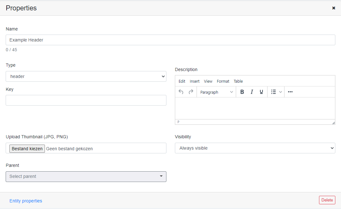
To edit the header attribute, click on the pencil icon next to the headers name. It will show you a new window where you can change several attributes.
- Name: You can fill in or change the name of the header.
- Description: Add a description (optional).
- Visibility: If this part should be visible for everyone, select ‘Always visible’. If this part should not be visible for end-users, select ‘Hidden by end-user’. To be able to get a preview, select ‘Always visible’.
- Type: This tells you what kind of attribute it is (Header).
- Upload Thumbnail: Upload a thumbnail (JPG or PNG) if you want to preview your header.
- Parent: Here you can select a parent attribute for the header. Selecting one means that the header attribute will place itself below its parent attribute.
Question
The question is the most used Attribute. A question is used to store options. Only 1 option can always be active within a question. For example; A question named: ‘’Color’’ can have 3 options named ‘’Red’’, ‘’Blue’’ and ‘’Green’’. Only one of these options can be active at a time.
Creating a Question Attribute:
- Click on “ Add attribute”
- Select Question under the tab Type
- Name the Question
To edit the question attribute, click on the pencil icon next to the questions name. It will show you a new window where you can change several attributes.
- Name: You can fill in or change the name of the question.
- Description: Add a description (optional).
- Visibility: If this part should be visible for everyone, select ‘Always visible’. If this should only be visible in the backend of the site select ‘Hidden by end-user’. To get to see a preview, select ‘Always visible’.
- Type: This tells you what kind of attribute it is (question).
- Upload a thumbnail: Upload a thumbnail (JPG or PNG) if you want to preview your header.
- Parent: Here you can select a parent attribute for the question. Selecting one means that the question attribute will place itself below its parent attribute.

Add an option to a question
To add a new option to a question follow the steps below:
- Click on the note icon next to the question that is going to contain the option you want to add.
- Scroll down and click on the Add option button in the right bottom corner.
- Click on the note icon next to the new option that appeared.
- Fill in the information:
- Name: Adjust the name, if wanted
- Description: Fill in a description (optional)
- Visibility: Select ‘Hidden by end-user’ if you don’t want this to be visible for the end-user, but can be used in the backend of the site. Select ‘Always visible’ if you want this to be visual on the frontend and backend of the site
- Default selected option: Tick this box if you want this to be the first option that is shown on your site, if no default is selected, the first option in the list will be used
- Price: If the selected option has an added value, you can add the extra price in this field. Fill in 10 if you want to add 10 euro to the standard price, fill in -10 if this option is 10 euro cheaper than the standard price
- Type: This tells you if this is a question or an option
- Upload thumbnail: Upload a thumbnail (JPG or PNG) if you want to preview your option.
- Click on ‘Save’ to save, or ‘cancel’ to go back
- If you want to change something after, repeat from step 3
- When you have multiple options and you want to change the default, tick the box that says “Default” or drag your preferred default to the top of the list.
Matgroup
A matgroup is a attribute where the material of an object or part can be altered.
Creating a Matgroup Attribute:
- Click on “ Add attribute”
- Select Matgroup under the tab Type
- Name the matgroup
To edit the matgroup attribute, click on the pencil icon next to the matgroups name. It will show you a new window where you can change several attributes.
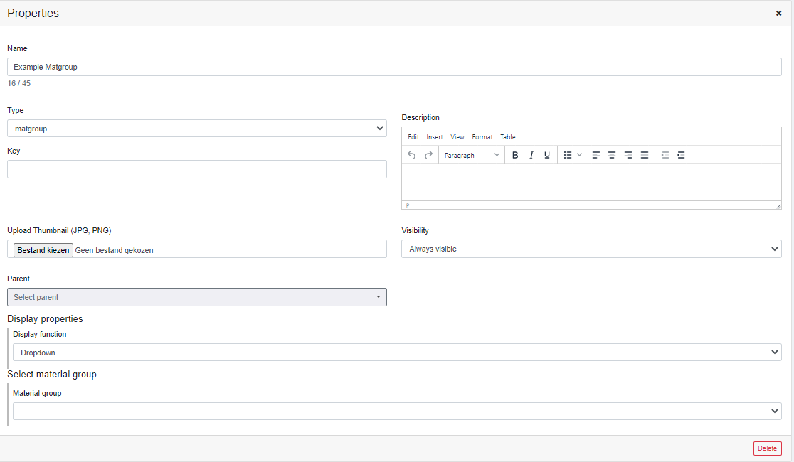
- Name: Adjust the name of the matgroup.
- Description: Add a description (optional).
- Visibility: If this part should be visible for everyone, select ‘Always visible’. If this should only be visible in the backend of the site select ‘Hidden by end-user’. To get to see a preview, select ‘Always visible’.
- Type: This tells you what kind of attribute it is (matgroup).
- Upload a thumbnail: Upload a thumbnail (JPG or PNG) if you want to preview your header.
- Parent: Here you can select a parent attribute for the matgroup. Selecting one means that the matgroup attribute will place itself below its parent attribute.
- Display function: Select the preferred display settings. This will determine how the matgroup will look in the configurator.
- Select material group: Select the material group that you want to link to this question. Only materials that are in this group will be displayed in the matgroup.
Color
If only the colour of the object should be altered you can choose this node. The colour attribute will only change flat colors.
Creating a Colour Attribute:
- Click on “ Add attribute”
- Select Color under the tab Type
- Name the color
To edit the color attribute, click on the pencil icon next to the color name. It will show you a new window where you can change several attributes.
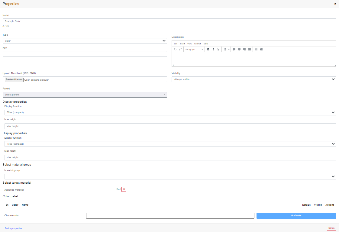
- Name: Adjust the name of the color attribute.
- Description: Add a description (optional).
- Visibility: If this part should be visible for everyone, select ‘Always visible’. If this should only be visible in the backend of the site select ‘Hidden by end-user’. To get to see a preview, select ‘Always visible’.
- Type: This tells you what kind of attribute it is (color).
- Upload a thumbnail: Upload a thumbnail (JPG or PNG) if you want to preview your color.
- Parent: Here you can select a parent attribute for the color. Selecting one means that the color attribute will place itself below its parent attribute.
- Display function: Select the preferred display settings. This will determine how the color will look in the configurator.
- Select material group: select the material group that you want to link to this color. Only materials that are in this group will be displayed in the matgroup.
- Select target material: Instead of a material group which holds several materials, you can also choose to link just a single material.
- Color pallet: Click choose a colour to open a color picker. Click on the preferred color and press add color to add it to the list.
Color attributes
Color_picker
If you want the customer to pick their exact colour themselves, choose this color_picker node. If you want to add a color picker, you can do so by following these steps:
- Click on “Add attribute”
- Select Color_picker under the tab Type
- Name the color_picker
To edit the colour attribute, click on the pencil icon next to the colour name. It will show you a new window where you can change several attributes.
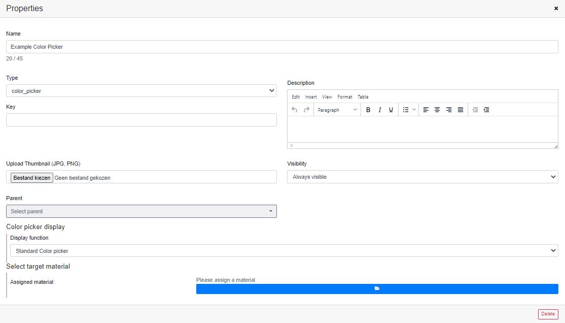
- Name: Adjust the name of the color_picker.
- Description: Add a description (optional).
- Visibility: If this part should be visible for everyone, select ‘Always visible’. If this should only be visible in the backend of the site select ‘Hidden by end-user’. To get to see a preview, select ‘Always visible’.
- Type: This tells you what kind of attribute it is (color_picker).
- Upload a thumbnail: Upload a thumbnail (JPG or PNG) if you want to preview your color picker.
- Parent: Here you can select a parent attribute for the color picker. Selecting one means that the color picker attribute will place itself below its parent attribute.
- Display function: Select the preferred display settings. This will determine how the color picker will look in the configurator.
- Select the target material: The color attribute of the material you select here will be influenced by the color picker.
image_upload
If you want the customer to upload their own image and project it on your mesh, choose this image_upload attribute. If you want to add an image uploader, you can do so by following these steps:
- Click on “Add attribute”
- Select image_upload under the tab Type
- Name the image_upload
To edit the image upload attribute, click on the pencil icon next to the image upload name. It will show you a new window where you can change several attributes.
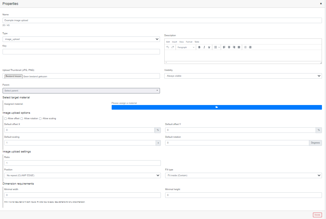
- Name: Adjust the name of the image_upload.
- Description: Add a description (optional).
- Visibility: If this part should be visible for everyone, select ‘Always visible’. If this should only be visible in the backend of the site select ‘Hidden by end-user’. To get to see a preview, select ‘Always visible’.
- Type: This tells you what kind of attribute it is (image_upload).
- Upload a thumbnail: Upload a thumbnail (JPG or PNG) if you want to preview your color picker.
- Parent: Here you can select a parent attribute for the image upload. Selecting one means that the image upload attribute will place itself below its parent attribute.
- Select target material: The material you pick here will be used to project the customer image on.
- Image upload properties: select how you want the image to fit on the image plane you made.
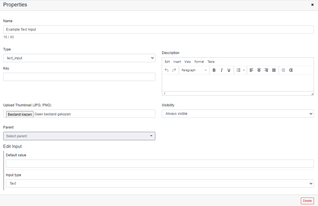
text_input
If you want any editable text on your end quote you can use this node. If you want to add a text_input, you can do so by following these steps:
- Click on “Add attribute”
- Select text_input under the tab Type
- Name the text_input
To edit the text input attribute, click on the pencil icon next to the text input name. It will show you a new window where you can change several attributes.
- Name: Adjust the name of the text_input.
- Description: Add a description (optional).
- Visibility: If this part should be visible for everyone, select ‘Always visible’. If this should only be visible in the backend of the site select ‘Hidden by end-user’. To get to see a preview, select ‘Always visible’.
- Type: This tells you what kind of attribute it is (text_input).
- Upload a thumbnail: Upload a thumbnail (JPG or PNG) if you want to preview your text input.
- Parent: Here you can select a parent attribute for the image upload. Selecting one means that the image upload attribute will place itself below its parent attribute.
- Edit input: Add your default text or input here. This text will show when loading the configurator.
- Input type: switch your type of input depending on what the customer can change.
text_to_image
If you want customizable text on your product you can use this node. This can also be used to add an engraving look to your product. If you want to add text to image, you can do so by following these steps:
- Click on “Add attribute”
- Select text_to_image under the tab Type
- Name text_to_image
To edit the text to image attribute, click on the pencil icon next to the text to image name. It will show you a new window where you can change several attributes.
- Name: Adjust the name of the text_to_image
- Description: Add a description (optional)
- Visibility: If this part should be visible for everyone, select ‘Always visible’. If this should only be visible in the backend of the site select ‘Hidden by end-user’. To get to see a preview, select ‘Always visible’
- Type: This tells you what kind of attribute it is (text_to_image)
- Upload a thumbnail: Upload a thumbnail (JPG or PNG) if you want to preview your text to image input.
- Parent: Here you can select a parent attribute for the text to image upload. Selecting one means that the text to image upload attribute will place itself below its parent attribute.
- Edit input: Add your default text or input here.
- Engraving: This option can be turned on to make the text look like its either engraved or embossed.
- Upload Fonts: Select the fonts that the customer can choose between. There is a wide range of fonts from different libraries that you can choose from.

Operable_numbers_input
This attribute adds an input for numbers. With this, you can link it to certain rules. If you want to add Operable_numbers_input, you can do so by following these steps:
- Click on “Add attribute”
- Select Operable_numbers_input under the tab Type
- Name Operable_numbers_input
To edit the operable numbers input attribute, click on the pencil icon next to the operable numbers input name. It will show you a new window where you can change several attributes.
- Name: Adjust the name of the Operable_numbers_input.
- Description: Add a description (optional).
- Visibility: If this part should be visible for everyone, select ‘Always visible’. If this should only be visible in the backend of the site select ‘Hidden by end-user’. To get to see a preview, select ‘Always visible’.
- Type: This tells you what kind of attribute it is (Operable_numbers_input).
- Upload a thumbnail: Upload a thumbnail (JPG or PNG) if you want to preview your operable number input.
- Parent: Here you can select a parent attribute for the operable numbers input. Selecting one means that the operable number input attribute will place itself below its parent attribute.
- Display function: select the preferred display settings.
- Edit input: Add an operand by clicking the green button on the right to make a text field. Under units, you can switch the parameters as preferred.