The Expivi embed application consist out of 2 separate application. The 3D viewer and the options:
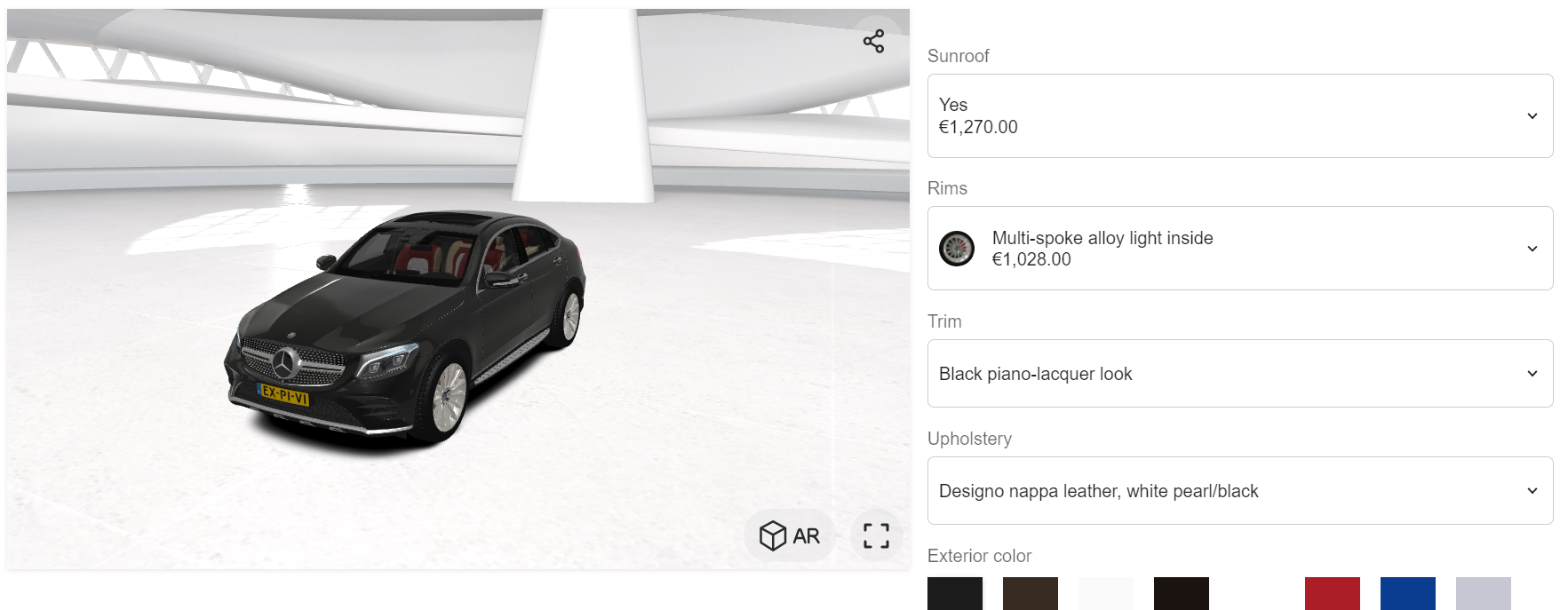
The options application provides various capabilities on how an option should be represented. As such it is possible to change the display type of an option inside the attribute’s settings:
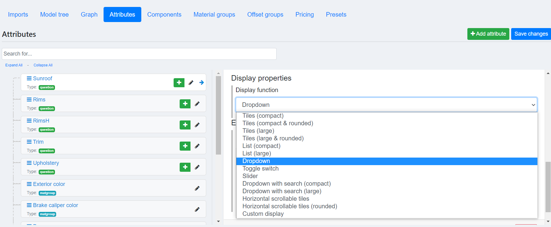
Expivi provides the ability to create a custom display function to represent the option to the end user.
Table of Contents
Architecture
The options application is created in Vue.js (https://vuejs.org/). The application follows an MVC like design, where each attribute has a component as a controller to handle the logic and a view component to represent the option to end-user:
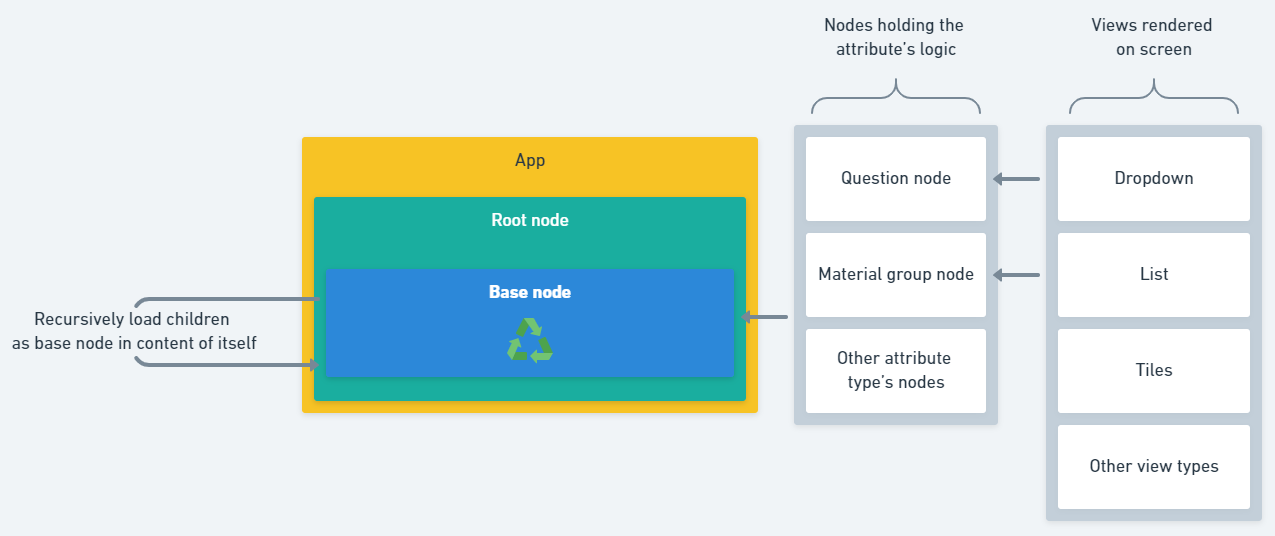
The Base node component loads the controller node component dynamically based on the attribute’s type and the controller node loads in the view component dynamically based on the display function selected by the user in Attribute’s settings.
Since the attributes are defined hierarchically, where each attribute can contain other attributes as children and those attributes can contain other attributes as children and so forth, the Base node renders all the attribute’s children as itself in it’s content recursively until all the attributes are rendered.
Custom display functions
While some attributes such as question and material group can use the same display functions, since they can provide the same model data to their view components, some other types such as image upload have a different model data requiring their own specialized view components. As such writing a vue component for each attribute type requires providing the input & output specialized to that attribute type.
Question & Material group
The controller nodes for question and material group attributes provide the same model data to their view component.
Provided data
Data passed to the view component are as follow:
{
label: string,// The name of the attribute
value: number|string,// The current value selected
items: {
id: number|string,// Value's id
label: string,// Name
description: string,// Description
thumbnail: string|null,// Url to thumbnail
color: hexstring|null,// Preferred background color
price: number|null,// Decimal number for price
visible: boolean,// If value is visible
disabled: boolean,// If value should be disabled
filtered: boolean,// If value is filtered out
categories: string[]// Value's categories
}[],
loading: boolean,// If the controller is loading
size: 'sm'|'lg',// Preferred size by user
rounded: 'yes'|'no',// Preferred rounded corners
node_id: Number,// The id of the attribute
}
Where the items is an array of all the possible values the customer can select from.
Returning the selected value
In order to pass the selected value by user back to the application, such that the selected values is applied on the configurator, the component should emit an event with name ‘input’ and data as the value’s id.
E.g. selecting the first value provided in items:
this.$emit('input', this.items[0].id);
Example component
In our example, the following component is expecting the attribute to contain exactly 2 values. The component will render a checkbox, where attribute’s first value is selected if the checkbox is unchecked and the attribute’s second value is selected if the checkbox is checked:
const CheckboxSelectorView = {
    template: `
<div>
    <input type="checkbox" :id="'checkbox_group_'+node_id" v-model="selected" />
    <label :for="'checkbox_group_'+node_id">{{label}}</label>
</div>
    `,
    data() {
        return {
            selected: false
        }
    },
    props: {
        label: String,
        value: {
            default: null
        },
        items: Array,
        loading: {
            default: false
        },
        size: {
            type: String,
            default: 'lg'
        },
        rounded: {
            type: String,
            default: 'no'
        },
        node_id: Number,
    },
    created () {
        this.updateCheckbox();
    },
    methods: {
        updateCheckbox(){
            this.selected = this.items.length > 0 && this.value != this.items[0].id;
        }
    },
    watch:{
        value(aNewValue){
            this.updateCheckbox();
        },
        selected(aNewValue){
            if(aNewValue && this.items.length > 1){
                this.$emit('input', this.items[1].id);
            }else if(this.items.length > 0){
                this.$emit('input', this.items[0].id);
            }
        }
    }
};
Using custom display functions
To use the display function, the component has to be registered on the option’s application as well as setting the custom display function on the attribute.
Registering custom display functions
To register the custom display function, the component has to be registered before instantiating the ExpiviComponents object (the option’s application). The component can be registered on the ExpiviOptionsVueInstance.prototype.$customViews object.
e.g. registering the CheckboxSelectorView:
ExpiviOptionsVueInstance.prototype.$customViews["Checkbox"] = CheckboxSelectorView;
In above example the CheckboxSelectorView is registered as Checkbox.
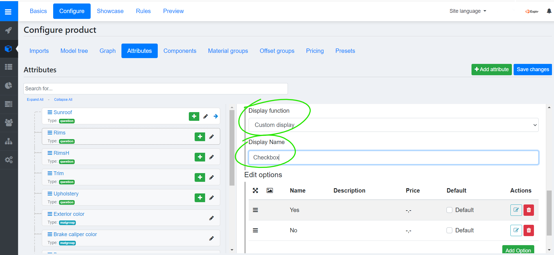
Setting the custom display function
To set the custom display function, select Custom display and enter the name of registered component in under Display name.
e.g. setting the custom display to Checkbox as e.g. provided in Registering custom display functions:
Example code
Below you’ll find a complete example code of the custom display functionality.
<html>
<head>
<title>Expivi - 3D Configurator sample code</title>
<link href="https://assets.expivi.net/options/latest/css/app.css" rel="stylesheet" />
<script src="https://assets.expivi.net/viewer/latest/viewer.js"></script>
<script src="https://assets.expivi.net/options/latest/js/app.js"></script>

<script src="https://unpkg.com/vue@2"></script>

<style>
.expivi-single-product-container {
display: table;
height: 100%;
width: 100%;
}

.expivi-single-product-container .expivi-viewer-container {
display: table-cell;
width: 64%;
padding-right: 15px;
vertical-align: top;
}

.expivi-single-product-container .expivi-option-container {
height: 100%;
display: table-cell;
width: 36%;
max-width: 400px;
}

@media (max-width: 600px) {
.expivi-single-product-container {
display: block;
}

.expivi-single-product-container .expivi-viewer-container {
height: 40vh;
display: block;
width: 100%;
padding-right: 0;
}

.expivi-single-product-container .expivi-option-container {
height: initial;
display: block;
width: 100%;
}
}
</style>
</head>
<body style="width: 100%;height: 100%;margin:0;padding:0">

<div class="expivi-single-product-container">
<div class="expivi-viewer-container">
<div id="viewerContainer" style="position: sticky;top:0;width:100%;height:100vh;"></div>
</div>
<div class="expivi-option-container">
<div id="priceContainer"></div>
<div id="optionsContainer"></div>
</div>
</div>

<script type="text/javascript">
var Token = "eyJ0eXAiOiJKV1QiLCJhbGciOiJSUzI1NiIsImp0aSI6IjQ3MWYwZTdiMDM4YmU3MmM5OTAxNGRhOGYwNmZiZTA0ZGM2YWUwZGMxMzBkMDA0OWE0ZTJkOTYzYTc1NTIyMjM3NWU0MjUzMDc3MjZmNjExIn0.eyJhdWQiOiIxIiwianRpIjoiNDcxZjBlN2IwMzhiZTcyYzk5MDE0ZGE4ZjA2ZmJlMDRkYzZhZTBkYzEzMGQwMDQ5YTRlMmQ5NjNhNzU1MjIyMzc1ZTQyNTMwNzcyNmY2MTEiLCJpYXQiOjE1OTkwMzUyMjgsIm5iZiI6MTU5OTAzNTIyOCwiZXhwIjoxOTE0NTY4MDI3LCJzdWIiOiIzIiwic2NvcGVzIjpbXX0.po5JOHLo5-y2-WJCdB6Yb29S20hoiQQFc7BA6i1c0FL4eRBDv6nC_2Bwv88UO8ZjvCjpxMY97M7acW7xjwbVaH-Dj69ZaDn4ynaX-o6zNFW0iVubAs7IK52nO5mGi0lZzvv2A0pzohOvr0ySy2g7lKgV5lXou2h-DIw-jmgtt_04bk_YTqKbPtMnxQa4NZoeytBt9U3ImmDWWHE-iQ06o0u13cyJfHOaJE9NLA_5EE99d1yE20vBorukIn_e61OJZfduQ6C6kOTI6cUJfmT8DEfalolTuAnhdgBHDrYXKsKyStyQd89pSgTp6aIt2w-SeOgwt9bKK0BZf5rIOF25Q4-JZXSCcB8aE-ng8RNsf_N2OCdAfCCKj9rrxpx3rXa1xI-dSKB2CDgQJAqof-92F7Ea6nCGRXwUl0oc9rTrQFfiG2vAcWrWS_7kI_wKU2ZU8v-6U41EDbikdlfk2xFgumchiqOk2o528jCD1STQFdAEKklYPjAiFtis1Ql_6HOQQXCGL6VabPoyWxmJtZ5THWJnIPBkhVwrOZoEbJupL8NwD87Du0ReGhuSyRZF9o2r4zyZCxky2q87Vx5lw_2cFmpgSDw5-megZ_Je4aX3_25fLEoxEgWCXmyxDMFeIxDU97Nzx0FRdNvCVRolkUGtTB3_g3Fz5gOeB3R9YJcgnlg";

window.addEventListener('load', function () {

let CheckboxSelectorView = Vue.component('checkbox', {
props: {
label: String,
value: {
default: null
},
items: Array,
loading: {
default: false
},
size: {
type: String,
default: 'lg'
},
rounded: {
type: String,
default: 'no'
},
node_id: Number,
},
data: function () {
return {
selected: null
};
},
methods: {
updateCheckbox(){
this.selected = this.items.length > 0 && this.value != this.items[0].id;
}
},
template: `
<div>
<h2>Our custom checkbox component:</h2>
<input type="checkbox" :id="'checkbox_group_'+node_id" v-model="selected" />
<label :for="'checkbox_group_'+node_id">{{label}}</label>
</div>
`,
watch: {
value(){
this.updateCheckbox();
},
selected(aNewValue){
if(aNewValue && this.items.length > 1){
this.$emit('input', this.items[1].id);
}else if(this.items.length > 0){
this.$emit('input', this.items[0].id);
}
}
}
});

ExpiviOptionsVueInstance.prototype.$customViews["Checkbox"] = CheckboxSelectorView;

const expiviInstance = new ExpiviComponent({
catalogueId: 67,
viewerContainer: "#viewerContainer",
optionContainer: "#optionsContainer",
priceContainer: "#priceContainer",
token: Token
});
});
</script>

</body>
<html>